While I am not sure that this would be the ideal lubircant and I certainly would throw up a “do not try this at home” disclosure, this certainly is what the Tin Man was looking for when he first saw Dorthy… I thought that this as was rather clever. Thoughts? ;-)
Posts Tagged ‘Graphic Design’
Great Ad
Thursday, November 11th, 2010The New Gap?!?
Sunday, October 10th, 2010Always all but too eager to gloat the fact that they were founded in 1969 (though often leaving off the “19â€), Gap some how thought that it would be a good idea to change their logo… Now this is not always a bad idea, but Gap is very well know for it’s visual identity. This 180 flop is NOT for the better. You can see where they were headed and I get the idea, modern, more sleek and contemporary, but this is a huge swing and a miss. What is that smudge behind the P? Is that the former gap blue square running away from the hideous new logo, and the fade is supposed to be a streak of color since it is running so fast? Absolutely terrible. My students make better stuff then this their first week of Illustrator. Not only is Gap pulling away from an identity that was so strong that just a bark blue square invokes the Gap name, but they moved to complete garbage. The closest comparison that I can think of is the the Tropicana switch back in February 2009. Tropicana on the other hand at least made a new sleek and aesthetically pleasing layout, the only folly there was the move from the visual identity that apparently everyone loved (seen by the steep sales drop). Someone is going to get fired over at Gap…
What Does That Symbol Mean Anyway
Wednesday, August 18th, 2010I don’t know about you, but there are a whole ton of icons and visual cues out there, especially in the tech world, that I haven’t the slightest idea what they are or why they look the way they do. Sure I know what they refer to and when they are used, but what is the back story, why that icon? Take that good old apple key symbol, which for those of you who did not know and are too young to remember, used to be a picture of an apple (hum, well that would have made more sense, seeing as it IS called the “apple” key). So, what is that strange design which replaced the logical one for which the “apple” key was labeled? Well this cool article written by Bryan Gardiner over at Gizmodo, goes into the history of some of these icons which we see every day. Pretty cool. Check it out: http://gizmodo.com/5612630/the-secret-histories-of-those-ing-computer-symbols
IAmCaplan Gets a Facelift
Wednesday, May 19th, 2010And not a moment too soon. Well, I have been talking about doing this for way to long and at last I have it finished…or at least I have come close as I am going to get. Since the minute I launched the IAmCaplan version 2.0, I have been talking about wanting to redesign my site. Well now I have. God only knows when it will happen again, but I am pretty pleased with how it turned out. I guess what they say is true, I truly am my worst client. I had all sorts of delays due to bugs and arduous process of redeveloping my content.
Anyway, I tip my hat to the old IAmCaplan and say hello IAmCaplan version 3.0. Seeing as the the site is brand squeaky new, there may be a few little bugs or glitches here and there. If you see anything, let me know so that I can polish it up. The new IAmCaplan comes loaded with all sorts of fun new features including: a much more contemporary design, custom jQuery, social media, some fun resources, all new content (including a case study-esque portfolio style), some new works and of course the blog is back! Oh yeah, I also stopped supporting IE6 (rest in peace old…er…friend?!?).
I hope that you enjoy the new site and I look forward to your feed back. :-)
Adobe CS5
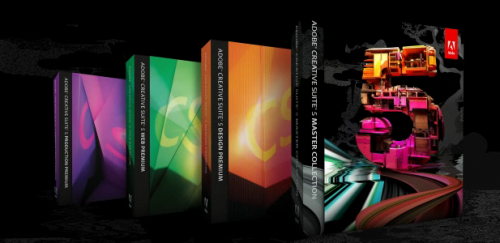
Tuesday, April 13th, 2010Being in the Graphic Design world how could I not offer my two cents about the amazing new Creative Suite from Adobe? Check out the movie clips to see exactly how these features work. I will drool a little over some of the highlights of the hotness and offer my opinion of what’s new and what’s better? (more…)