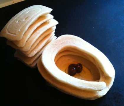
I came across this Blog the other day and just had to share: Jim’s Pancakes. While these may not be the Mona Lisa (though if suggested I am sure he would give the mysterious woman a go), Jim does a wonderful job making weekend pancakes magical for his little daughter. Many of the images on his blog are whimsical and fun. I found myself smiling on more then one occasion. The only concern that I have is that some of these work of culinary art are rater erect and as such must be rather crispy…Crisp pancakes? I always think of fluffy soft pancakes, but then again mine are not pretty or creative like these. Never the less, makes me hungry :-D
Posts Tagged ‘Design’
Now Those Are Pancakes!
Tuesday, October 19th, 2010Animator vs. Animation
Tuesday, October 12th, 2010Well you may have seen the trailer and/or you may have heard it rumored, but now the actual clip of Animator vs. Animation 3 is live for the viewing. Created by Alan Becker, this clip of a Flash animation decimating a “animator’s” computer is a witty and clever addition to the series. With the Chosen One breaking his bonds of servitude, he is back and with a vengeance. Of course the novelty of the idea has worn off a bit, never-the-less this is still a fun clip to watch and Flash student always get a kick out of it. Watch the full clip at Atom.com. Have a look…
The New Gap?!?
Sunday, October 10th, 2010
Always all but too eager to gloat the fact that they were founded in 1969 (though often leaving off the “19â€), Gap some how thought that it would be a good idea to change their logo… Now this is not always a bad idea, but Gap is very well know for it’s visual identity. This 180 flop is NOT for the better. You can see where they were headed and I get the idea, modern, more sleek and contemporary, but this is a huge swing and a miss. What is that smudge behind the P? Is that the former gap blue square running away from the hideous new logo, and the fade is supposed to be a streak of color since it is running so fast? Absolutely terrible. My students make better stuff then this their first week of Illustrator. Not only is Gap pulling away from an identity that was so strong that just a bark blue square invokes the Gap name, but they moved to complete garbage. The closest comparison that I can think of is the the Tropicana switch back in February 2009. Tropicana on the other hand at least made a new sleek and aesthetically pleasing layout, the only folly there was the move from the visual identity that apparently everyone loved (seen by the steep sales drop). Someone is going to get fired over at Gap…
What Do Designers Know?
Monday, September 20th, 2010So I’m sure that you have thought to yourself before, “self why does this ‘designer’ get paid to do this design work when in fact he doesn’t know what he is doing? I mean seriously, a website with white space? Or what about the fact that my logo is not so large that it hits you in the face?” Well no worries. Not only are you not the first person to have though of this, but this awesome company has come up with a solution, check out the above YouTube clip to hear about the exclusive offer.
One of my students showed me this, priceless. Enjoy :-)
Amazing Stop-Paint Animation
Friday, July 9th, 2010BIG BANG BIG BOOM – the new wall-painted animation by BLU from blu on Vimeo.
So surfing around I stumbled onto this amazing artist. He goes by Blu, and makes these amazing stop action movies. I can only image that this must take forever to make. The concept is very unique and interesting, sort of an evolution of everything starting with the big bang and going through the destruction of the world, and the execution delightfully playful. Blu does a really wonderful job playing with size, proportion and a mixture of two the three dimensional media to create this very entertaining work of art. Have a look and see what I am talking about. Blu also have several other works as well and a quirky website, which though a bit chaotic and a touch annoying at times features several of his other works (seen here). Definitely worth checking out!


 Splist for jQuery: I am very excited to announce my jQuery plug-in -